

Miraculous product of efficiency!
Efficiency is beautiful. Nature gives us so many examples. Out of the millions of sperm that try and enter the fallopian tube, only one finally enters the egg. The moment it does, the door is shut for all others around it.
No matter how many millions of sperm try, only one can enter. The fertilized human egg takes shape over 36 weeks from a tiny cell into a beautiful baby. This happens with hardly any influence of the mother or the father. Within 9 months, another miracle is safely delivered in the hospital rooms around the world. In every step of the human baby’s formation till its growth, nature shows the best efficiency in true form.
While not exactly like nature, should we not aspire for some efficiency in investing as well? In my earlier article, we covered the basics of investing efficiently, which focused on costs. There, we also introduced the concept of ‘efficient frontier’. That chart is given here.
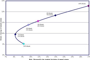
Efficient Frontier: The holy curve of investing!
Dr. Harry Markowitz, a PhD in economics from the University of Chicago, came up with the concept of Modern Portfolio Theory (MPT) in 1950’s. Basically, MPT says, as an investor, you should expect to get a higher return for taking higher risk.
He won the Nobel Prize in 1990 for this discovery, along with William Sharpe and Merton Miller (other Chicago academics – what do they put in the water over there?) for their famous capital asset pricing model (CAPM). The CAPM pretty much forms the basis for all modern finance and portfolio management. Investopedia describes the practical importance of the efficient frontier curve that defines MPT and CAPM this way:
Every possible combination of assets that exists can be plotted on a graph, with the portfolio’s risk on the X-axis and the expected return on the Y-axis. This plot reveals the most desirable portfolios. For example, assume Portfolio A has an expected return of 8.5% and a standard deviation of 8%, and that Portfolio B has an expected return of 8.5% and a standard deviation of 9.5%. Portfolio A would be deemed more “efficient” because it has the same expected return but a lower risk. It is possible to draw an upward sloping hyperbola to connect all of the most efficient portfolios, and this is known as the efficient frontier. Investing in any portfolio not on this curve is not desirable.
So, by definition, any investment portfolio having a risk and return that’s not exactly on the curve is inefficient. All these ‘inefficient’ asset portfolios will be below the efficient frontier curve.
Why are they called inefficient? Because you can always get a better return for that portfolio’s risk by moving up vertically to the point where it hits the curve. Similarly, you can have a lower risk for the portfolio’s expected return by moving horizontally to the left till you hit the efficient frontier.
By design, there is no portfolio that can exist above the curve. Efficient portfolios are on the curve, while inefficient portfolios are below the curve.
A portfolio consisting of 100% bonds will be at the bottom left of the curve. From then on, addition of stocks increases the risk and expected return. Notice the ‘bend’ at the bottom of the curve? It shows that a portfolio of 80% bonds and 20% stocks is actually less risky and offers a better return than a portfolio of 100% bonds, which is not as efficient. This is due to low correction between the two asset classes – think of it like bit of a ‘free lunch’. But it quickly normalizes once you move up the stock allocation.
The classic 60/40 allocation (favorite of financial planners) also appears on the curve, insomuch as it is efficient from the point of view of balanced risk and return. A portfolio containing 100% stocks is also efficient, and it appears at the extreme right of the efficient frontier curve. It represents the point where you can capture the highest possible return for the highest expected risk.
Enough talk about sexy curves, let’s see how it works in real life.
I use Personal Capital to monitor our finances. They offer a nifty tool to assess where your portfolio is in comparison to the efficient frontier. It also suggests a target allocation for your consideration, and in my case, it includes sizable bond allocation. But as a guy comfortable with my current allocation of 100% stocks, I am happy with where it appears on the efficient frontier curve.
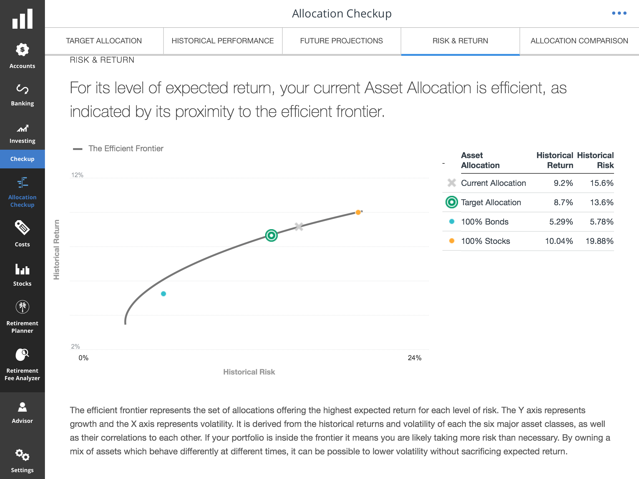
TFR’s Efficient Frontier.
See the gray X marked where my current allocation is? Since X is right on the efficient frontier curve, my portfolio is efficient, as Personal Capital certifies!
This might appear odd. I mentioned earlier my portfolio tracked by Personal Capital is 100% stocks. In that case, should it not appear at the same place where the orange dot for 100% stocks appears, on the extreme right? Why would X be marked further down the curve?
This is where we need to understand that not all 100% stock portfolios will have the same risk and return profile as what the efficient frontier curve says. My portfolio, despite being 100% stock, has both a slightly lower expected return and a significantly lower risk profile. This is because I have a higher allocation to defensive sectors (like utilities and consumer staples) than what a stock index like S&P 500 has.
To understand this further, let’s start with this table:
A tale of two portfolios
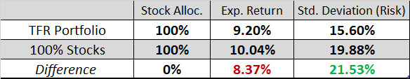
Despite both being in 100% stock, notice that the TFR portfolio has an 8.37% lower expected total return compared to a complete 100% stock portfolio (like SPY or VTI ETF’s or their index fund equivalents). For accepting this slightly lower expected return, I am also benefiting from a 21.53% reduction in “risk” (standard deviation). Overall, this is a compromise I can live with.
In other words, to have the same risk (15.6%) as my portfolio, an index investor must have a portfolio of 78% stock index and 22% cash. Notice that even bonds have some volatility, only cash has zero standard deviation and practically zero return as well (probably ~0.2% interest, in today’s times). Similarly, to have the same risk as my portfolio using indexed stock/bond allocation, the equivalent portfolio should have 69.6% in a US stock index fund and 30.3% in a US bond index fund.
Now, let’s look at the table below where my portfolio is compared to risk-equivalent stock/cash and stock/bond portfolios and see what the expected return is.
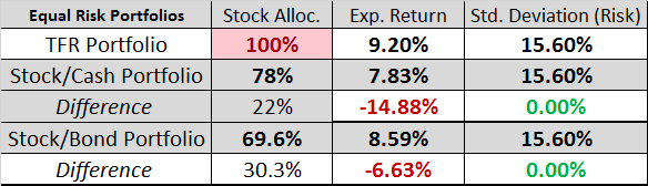
Therefore, these two index portfolios, while having the same risk (standard deviation) as my 100% stock portfolio, offer lower expected return. The index stock/cash portfolio performs even worse than stock/bond index portfolio because cash doesn’t generate any return (in today’s world) compared to bonds (which also have lower returns than the 5.29% expected by Personal Capital, but we will give bonds the benefit of doubt here).
Whereas 100% of my portfolio is in dividend stocks and some international indexes. Since they are diversified across sectors and industries with a defensive tilt, some stocks zig while the others zag. That’s why the combined effect is a significant reduction in risk (due to poor correlation, if you want to get more technical). I structured it this way to mitigate the impact of downside scenarios at the cost of not capturing the highest upside scenario of S&P 500 index.
This kind of fine-tuning is why I prefer self-directed investing over index fund investing. Indexing is an excellent investing strategy for many, but don’t assume it is less risky because of diversification. We saw in the first table above that it is possible to construct a 100% stock portfolio at a lower risk or standard deviation (as Personal Capital has evaluated it) than the same invested in a stock index. For those wanting to read a detailed analysis of both investing strategies, please see here.
Efficiency, not only in cost but also in risk-adjusted return, is a worthwhile goal for all of us to have in our investing journey. That’s what getting the most bang for your buck is really all about.
Raman Venkatesh is the founder of Ten Factorial Rocks. Raman is a ‘Gen X’ corporate executive in his mid 40’s. In addition to having a Ph.D. in engineering, he has worked in almost all continents of the world. Ten Factorial Rocks (TFR) was created to chronicle his journey towards retirement while sharing his views on the absurdities and pitfalls along the way. The name was taken from the mathematical function 10! (ten factorial) which is equal to 10 x 9 x 8 x 7 x 6 x 5 x 4 x 3 x 2 x 1 = 3,628,800.
6 comments on “Investing: Get The Most Bang For Your Buck”